Big Picture Important Charts
USA COVID ‘Cases’ per Day vs Deaths per Day - two years data
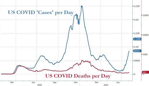
Fig. 37 August 3, 2021 - USA COVID ‘Cases’ per Day vs Deaths per Day - two years data
Source: ‘Experts’ Move The Goalposts, Declare Herd Immunity Threshold Now 90% Due To Delta August 3, 2021
2020 deaths across Euromomo countries
2020 deaths across Euromomo countries
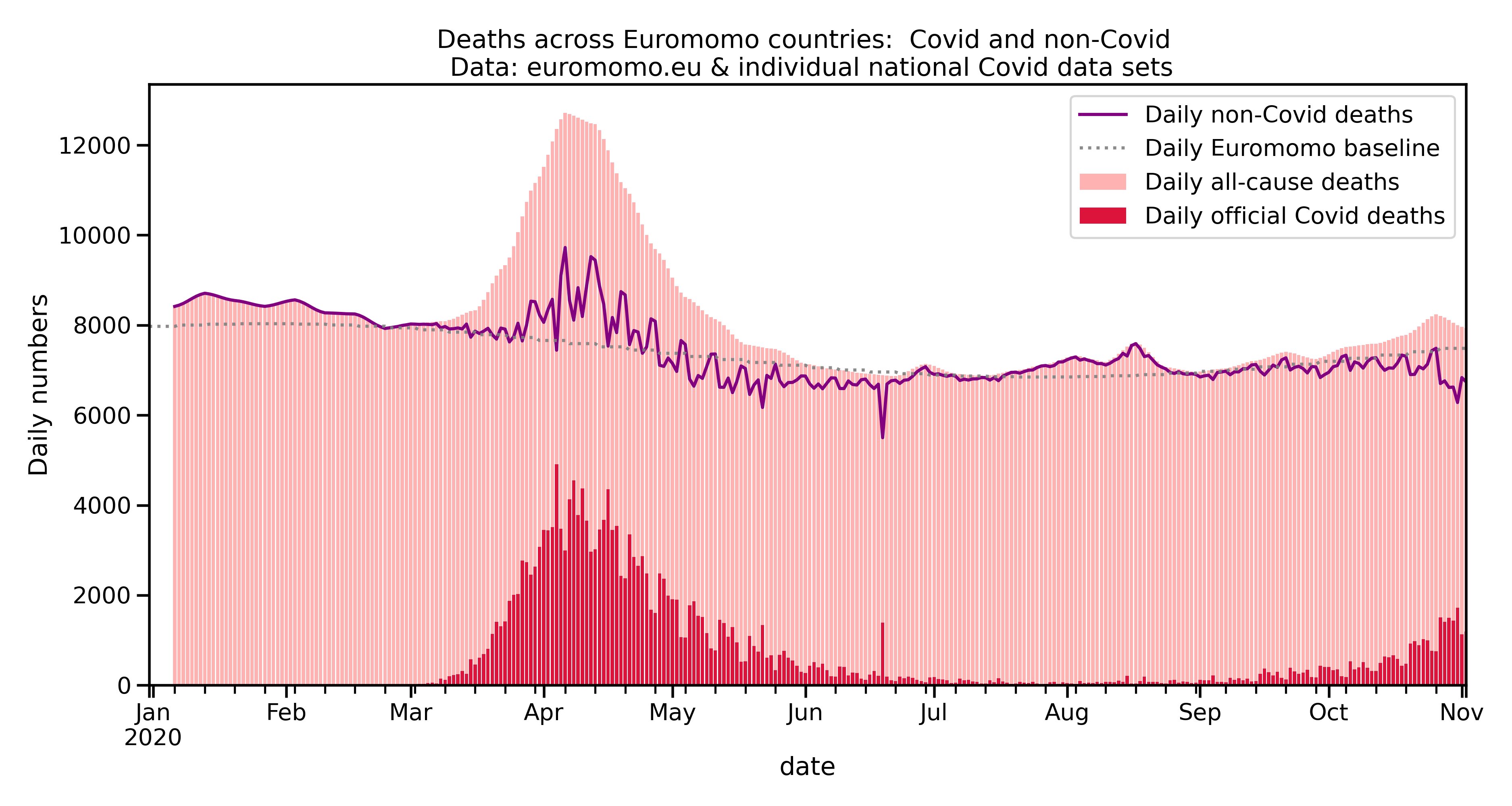
Fig. 38 2020 deaths across Euromomo countries
Flu vs. Covid 1916 to December 2020
Flu vs. Covid 1916 to December 2020
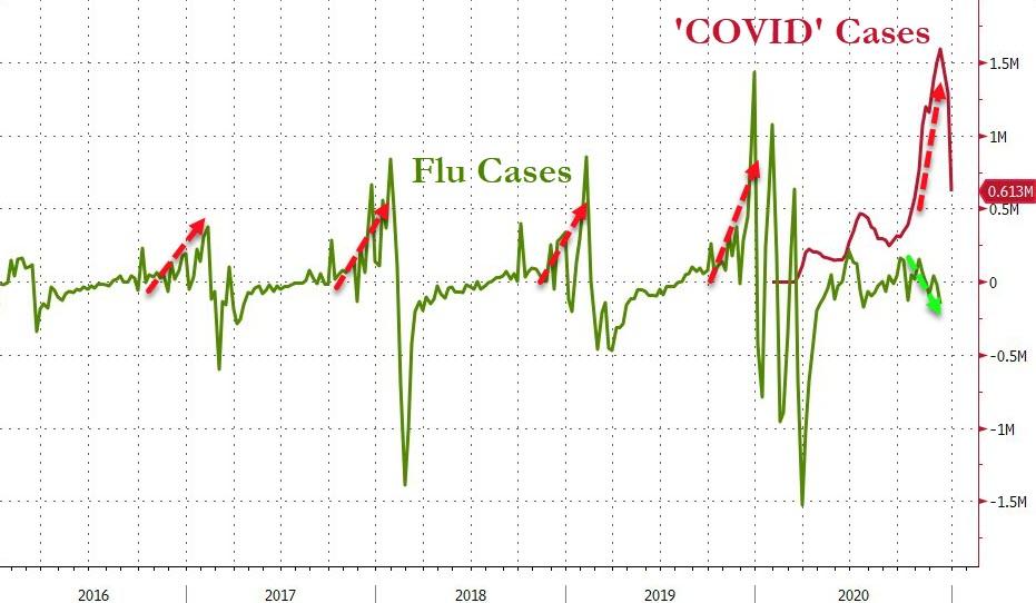
Fig. 39 Flu vs. Covid 1916 to December 2020

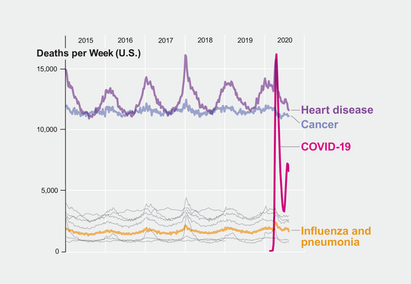
Deaths per week USA by cause of death 2015-2020 - COVID‐19 is lower incidence than Cancer and Heart Disease
Deaths per week USA 2015-2020 by cause of death
Personal Statement by Thomas Connors March 28 2021
My background as an undergrad in computer science and so making charts and graphs and getting data is pretty fundamental, and what I found is you can’t get the data - they started hiding the data in 2018, so this has been planned, you cannot compare how many people died of the flu this year compared to last year. You can get the weather data, you can get the stock market data, but you cannot find out how many people died by cause this year versus last year - they freaking hid that data - I can find out the temperature on any location on the planet on any day in history, all data is open forever permanently, so for them to remove data - how in the world could they do that - why would they do that? Across the world in all the nations. State federal local. all death by cause data has been removed across the planet you cannot find it. so for example you simply cannot create a chart that says how many people are dying or in each age category you cannot find that data it’s hidden, it’s not public. But it used to be.
This is the only chart I’ve seen with the correct level of data - it accurately tells a story. But I grabbed this last summer - our worldwide local and national media does not do accurate informative charts such as this. In particular, the data science guy who does so much analysis for sports and elections at Fivethirtyeight.com, Nate Silver - instead of doing any thoughtful analysis he’s telling us we should comply with lockdowns and vaccinations and he doesn’t do any good data science charts he doesn’t review this level of data and that is completely fake because the rest of his website he’s doing all sorts of intricate analysis. He’s on one of those young leaders programs with the world economic forum in davos so they’ve basically capture the media influencers and they put them on the payroll and they give them access to private websites and that’s where they really are communicating together and we are just the sheep that is being told the public story.
So our local and federal media should be putting out all sorts of interesting charts like this one here but this is the only one I’ve seen and this was like a year ago.
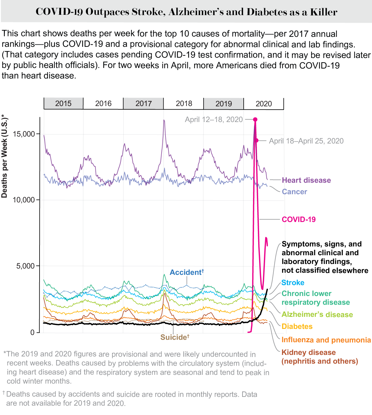
Fig. 41 Deaths per week USA 2015-2020
CDC survival rates by age September 2020
CDC survival rates by age September 2020

Fig. 44 CDC survival rates by age September 2020
CDC survival rates by age September 2020
UK virus cases hospital ICU deaths
UK virus cases hospital ICU deaths
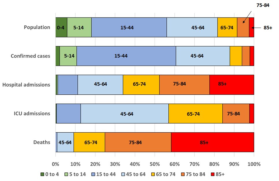
Fig. 45 virus cases hospital ICU deaths
Source: Twitter Christina Pagel @chrischirp Jan 16, 2021
Last change: Tue, 03 Aug 2021 10:25 PM UTC